The Brief

Truli.com is the premier internet destination for inspirational family entertainment featuring a media library with thousands of on-demand videos and streaming content in English and Spanish. Get access to a wide range of family friendly entertainment, inspirational videos, podcasts and the latest blogs covering current events, culture, parenting, entertainment, faith, lifestyle & personal development.

Unfortunately, their brand and web presence wasn’t providing their programmers with an experience befitting to the vision and overall strategy of Truli. Everything was out of date and they were fading into the background.

Time to get started.

Color and Typography, oh my!

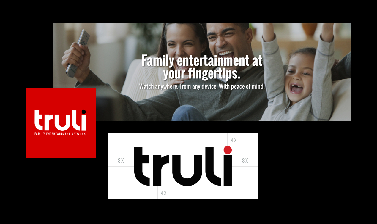
Through a very collaborative effort, I helped the California-based OTT redesign and relaunch its brand and web platform with an emphasis on user-driven content and a hybrid blend of user experience and visual design. We started with color theory. The previous palette was too large; it included the rainbow. We tested primary colors and paired them with very complimentary colors. The final logo embodied their bold and passionate company culture.

On to the website…

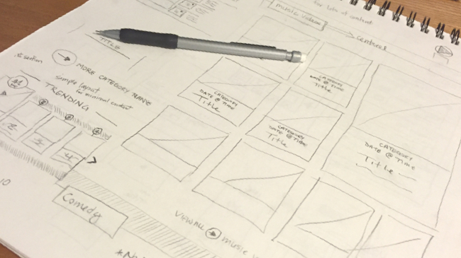
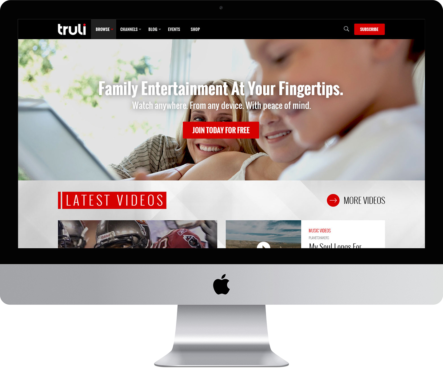
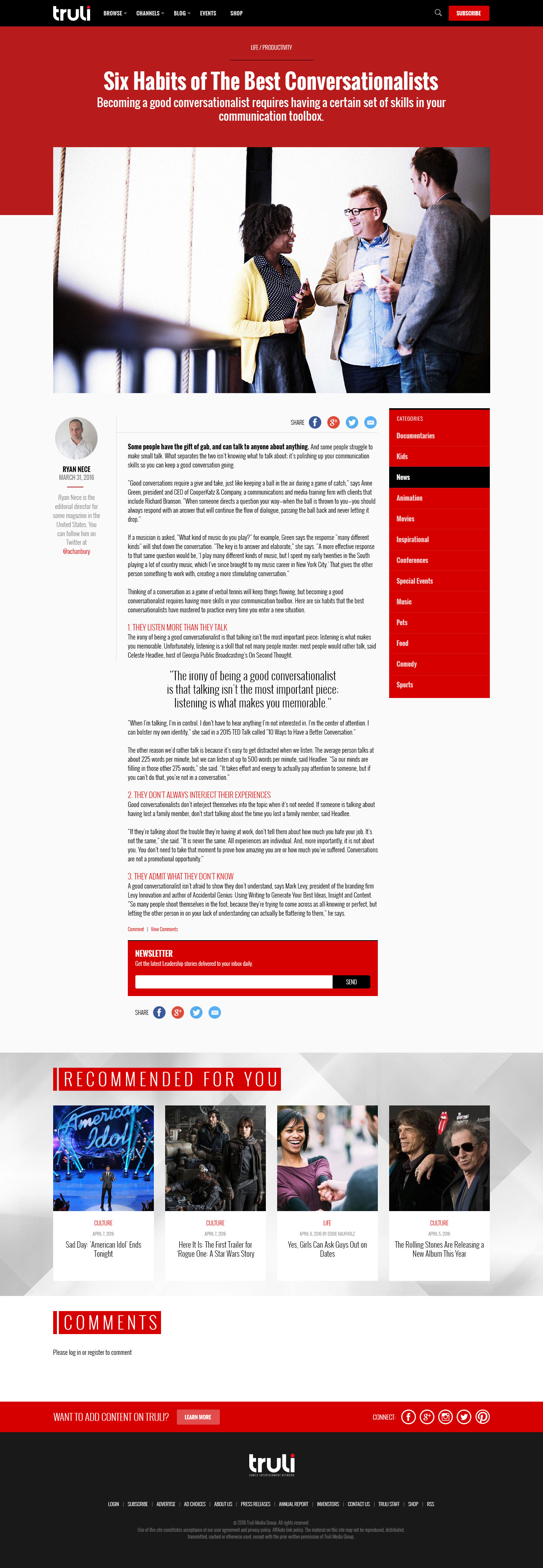
The team at Truli provided me with the history of their existing site and goals for the new platform to elevate the viewer’s experience. In addition to this, we needed to find ways to increase the number of programmers providing content. The redesign had to leverage the use of great photography, pairing it with captivating titles, and streamlining the user flow in a way that delights the viewer and promotes staying longer on the site.

See the results for yourself…

Want to build something great? GET IN TOUCH