Case study — datacenterHawk
One design layer across the product, the website, and the sales floor.
datacenterHawk had a sophisticated data platform and three surfaces that didn't look like the same company. I was brought in to fix bounce rates on one set of pages, and stayed three years — redesigning the product, building the pattern library underneath it, and carrying the system out to the marketing site and the sales floor.
- +42%
- App usage
- +4%
- Actionable facility leads
- 200+
- Screens designed
- 3 yrs
- As their only UX designer
Measured in datacenterHawk's analytics after exposing more of the platform's toolset across its sub-features
On the public provider profile pages, after prioritizing information architecture and clarifying primary actions
Desktop, tablet, and mobile responsive layouts across the full product
A single engagement from January 2018 through March 2021
The company
A search engine for a market with no easy answers.
datacenterHawk helps IT teams, consultants, operators, and investors find and compare data center and cloud capacity. Their platform pulls together real-time availability, financial data, and market research, then turns it into reports people can hand to a decision maker.
It's genuinely hard software to build, and it worked. The problem was never the data. It was everything wrapped around it.
The brief
Fix the pages people landed on and left.
A colleague referred them to me with a specific problem: provider profile pages were bouncing. These were the pages prospects landed on from search and sales outreach — the surface doing the most work to convert interest into subscriptions, and the one losing people fastest.
Auditing those pages turned up a bigger issue. The profile page wasn't broken in isolation. It was one symptom of three surfaces that had grown separately:
- The product — powerful, dense, and inconsistent screen to screen
- The marketing site — visually unrelated to the thing it was selling
- Sales collateral — a third look again, assembled as needed
datacenterHawk had never had a UX designer. I was the first one, and the only one. The audit, the research, the flows, the interface, the front-end standard, and the printed collateral all ran through the same person — for three years.
Someone could read a one-sheet, visit the site, and start a trial while feeling like they'd dealt with three different vendors. That gap is expensive, and it doesn't show up in any single page's analytics.
Approach
Five decisions that shaped the work.
Each one had a cheaper or faster alternative. Here's why I didn't take them.
Decision 01
Start with the product, not the website.
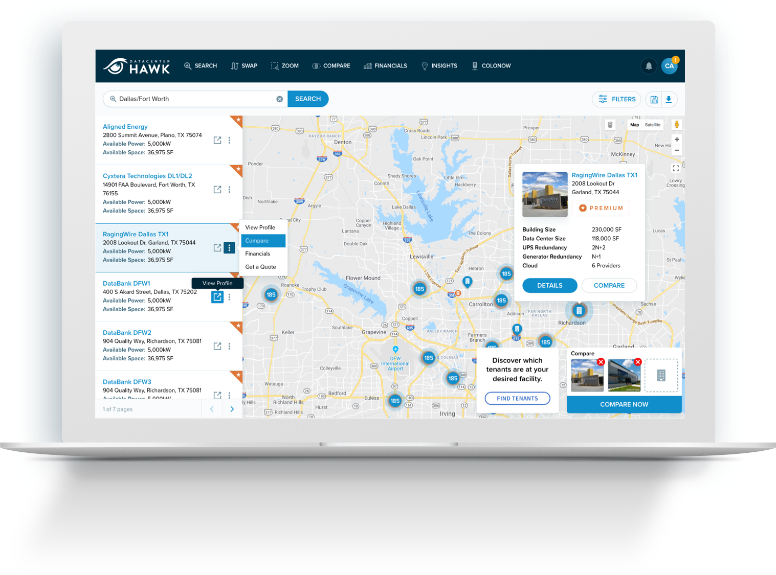
The obvious move was the marketing site — it's visible, it's faster, and it's what most people mean by "rebrand." I started with the application instead.
The product is where subscribers spend their time and where renewals are won. Fixing the storefront before the store would have made the mismatch worse, not better — sharper promise, same friction underneath.
Working through the product first meant establishing a method before touching a screen:
- Use cases, personas, and experience flows — so decisions traced back to a real user with a real job
- Sitemaps and wireframes built on data and testing rather than preference
- UI specifications detailed enough for developers to build from without guessing
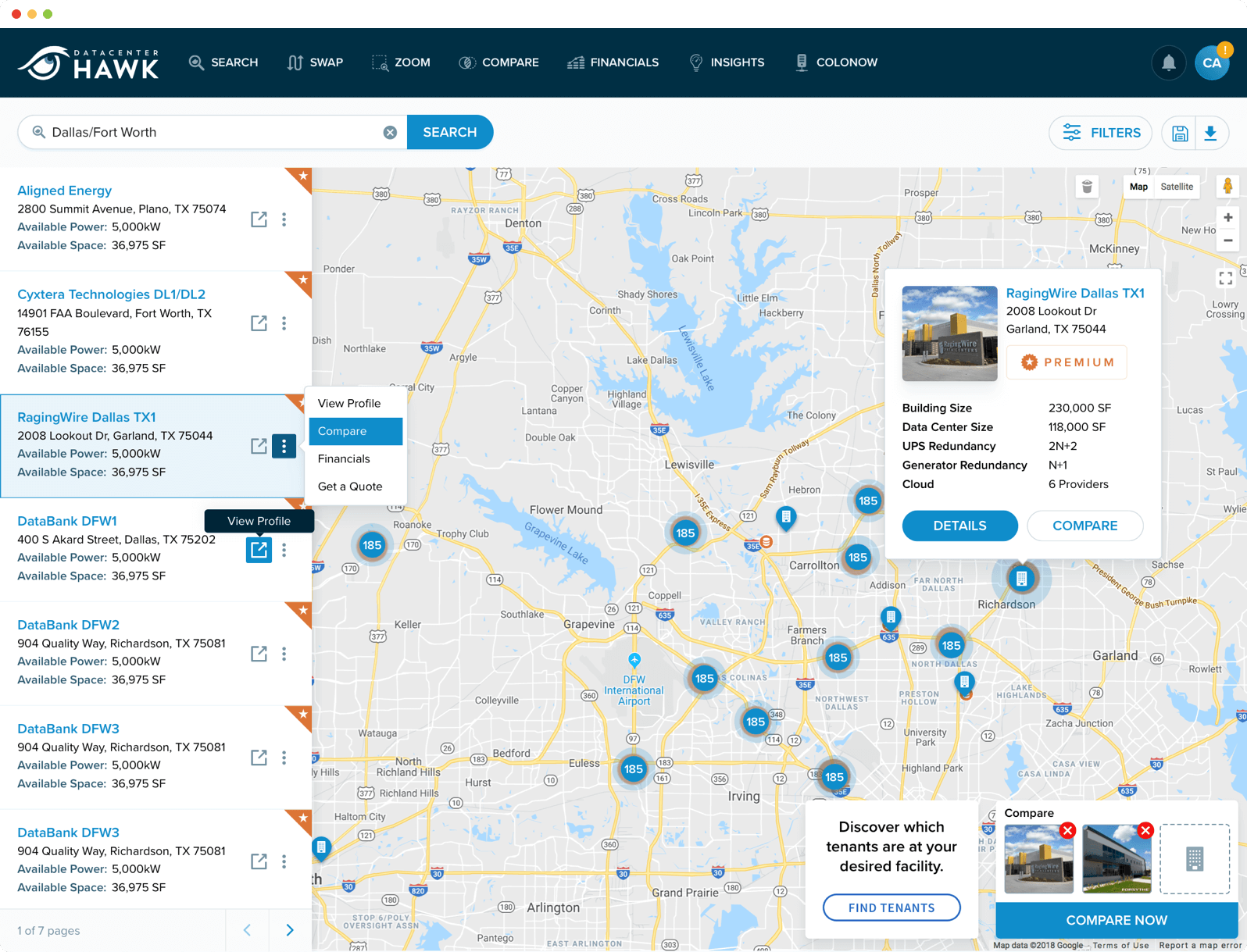
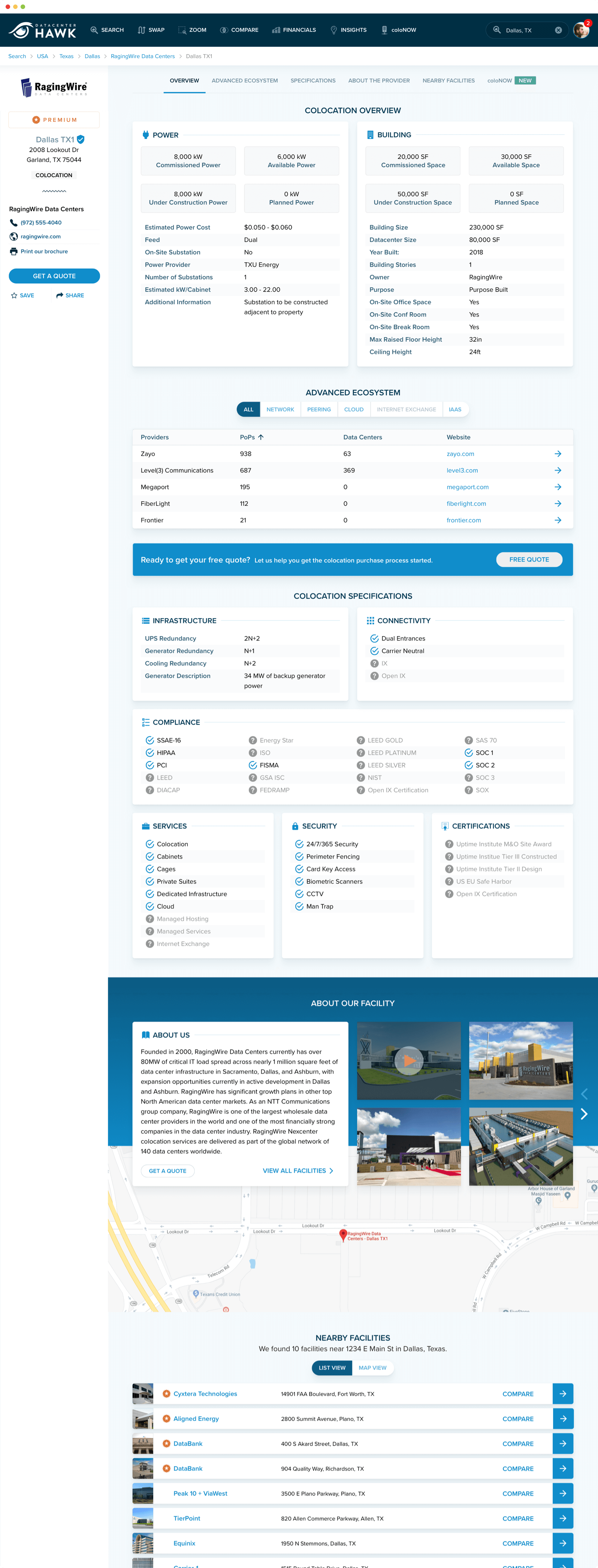
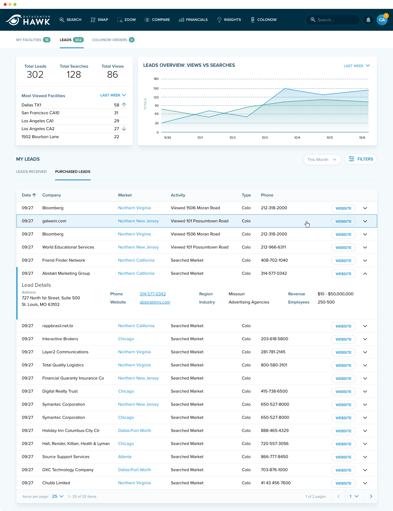
That work restructured search and comparison, rebuilt the provider profiles that started the engagement, and clarified the market insight and transaction dashboards so dense data stayed readable. It also surfaced tools most people never knew they had — exposing more of the toolset across its sub-features raised app usage by 42% in their analytics.
Decision 02
Compose the design system instead of inventing one.
Two obvious paths: build a bespoke system from scratch, or adopt an existing one wholesale. I did neither.
The pattern library drew on portions of IBM's Carbon Design System — chosen because Carbon had already solved dense, data-heavy interfaces and accessibility at enterprise scale, which is exactly what datacenterHawk is. That sat on the Bootstrap framework their developers already worked in, with a branded design layer over both.
The best system is the one the team can still use after you leave.
Building bespoke would have left them maintaining something only I fully understood. Adopting Carbon wholesale would have made them look like everyone else using it. Composing from both meant the hard problems were already solved, the developers needed no ramp-up, and the brand lived in the layer above — the part that's cheap to maintain and easy to hand off.
It also meant nobody was rebuilding a component that already existed — the practical reason a pattern library pays for itself as a product grows.
Decision 03
Design a feature that makes the customer's customer money.
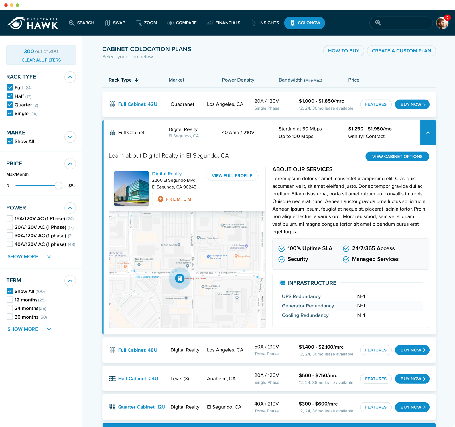
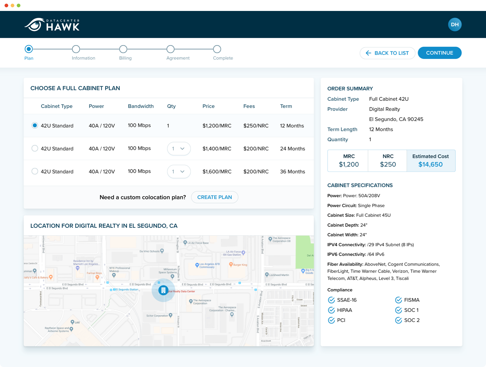
Facilities had unused cabinet space sitting idle. Buyers had no fast way to find or purchase it. Both sides were already on the platform.
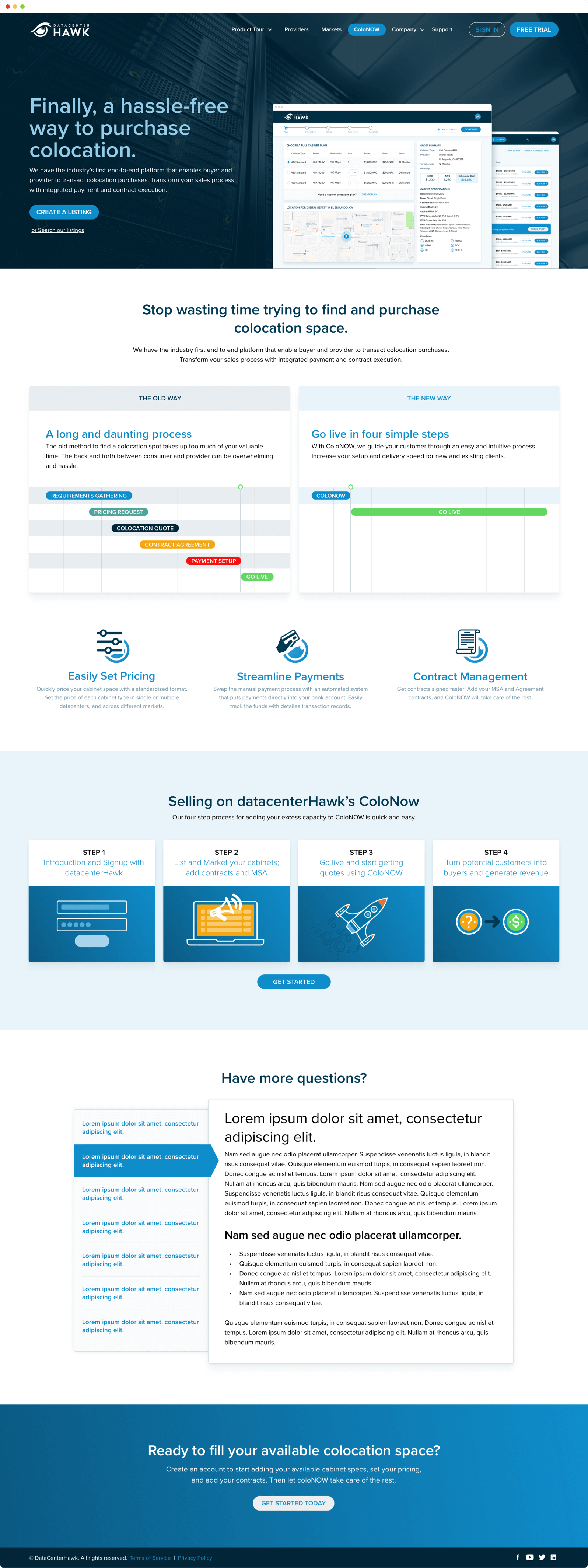
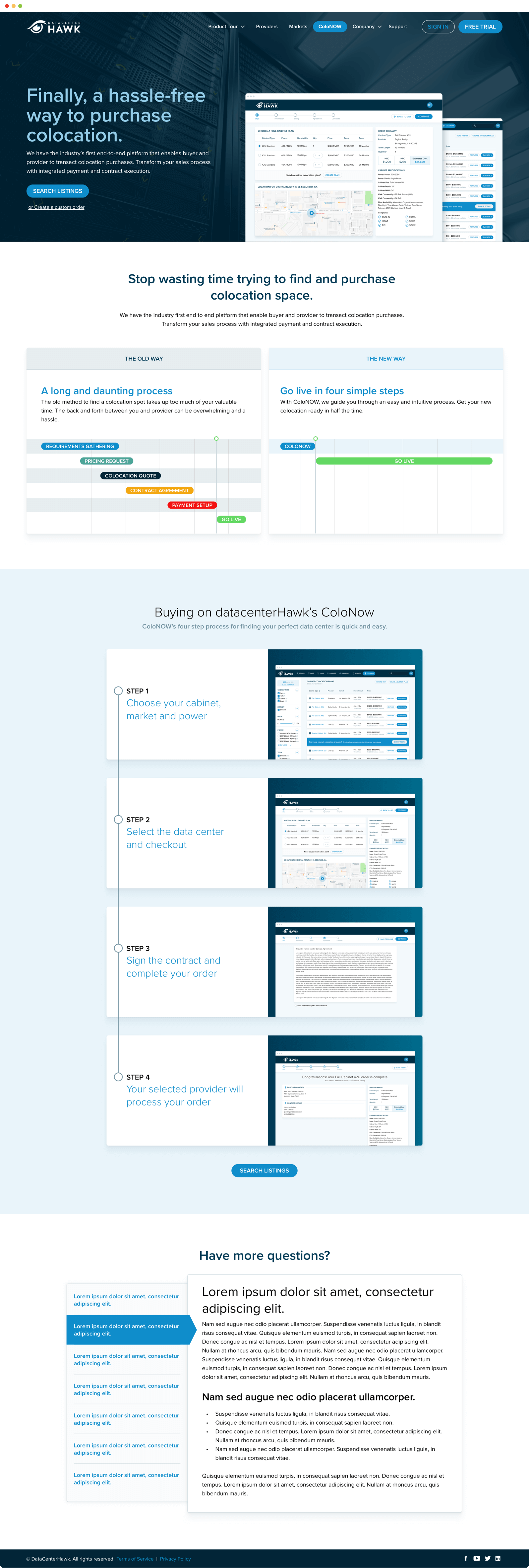
I designed coloNOW — a workflow letting facilities list available cabinet space and buyers purchase it through a short, direct flow. Not a usability improvement to something that existed. A new capability, and a new revenue stream for datacenterHawk's customers.
A feature that makes your customers money is the hardest kind to churn away from.
This is what I mean by design being a business decision. The interface work mattered, but the leverage was in noticing that two groups already in the same product had no way to transact with each other.
Decision 04
Make the marketing site look like the product it sells.
With the product settled, the website could be rebuilt against something real instead of against a mood board.
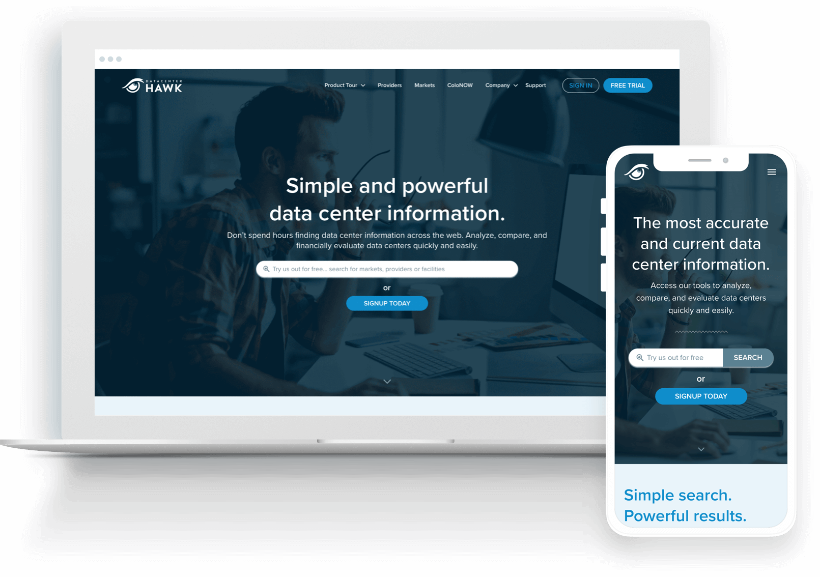
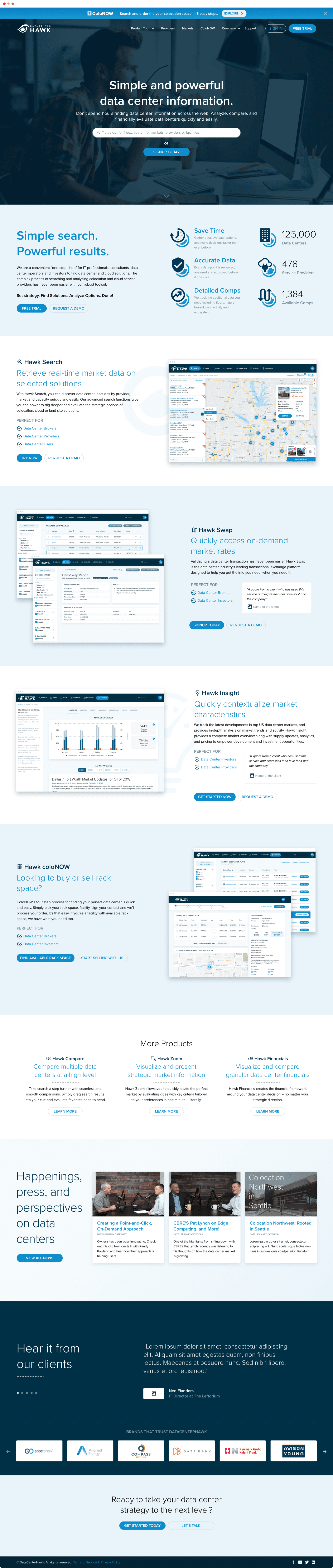
The goal was to make the value obvious, then ask for a trial or a demo. But the quieter goal mattered more: by the time someone signed up, the product should already feel familiar. Shared patterns across the site and the app mean the first session isn't the first time you've seen the interface.
The rebuilt site included:
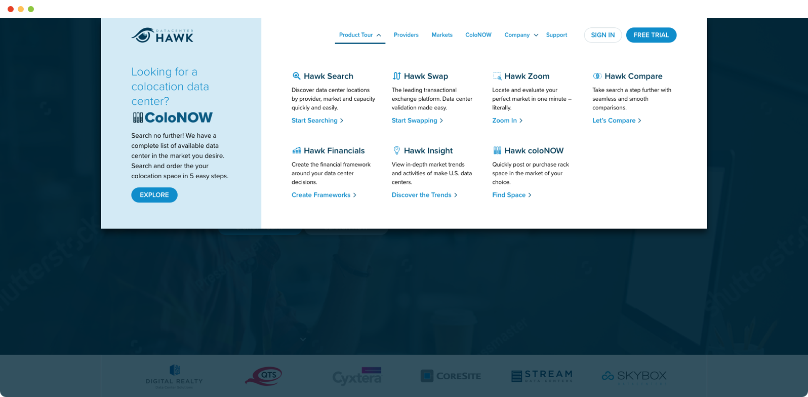
- A products mega menu that made a broad toolset navigable
- Pricing and subscribe flows built to convert, not just inform
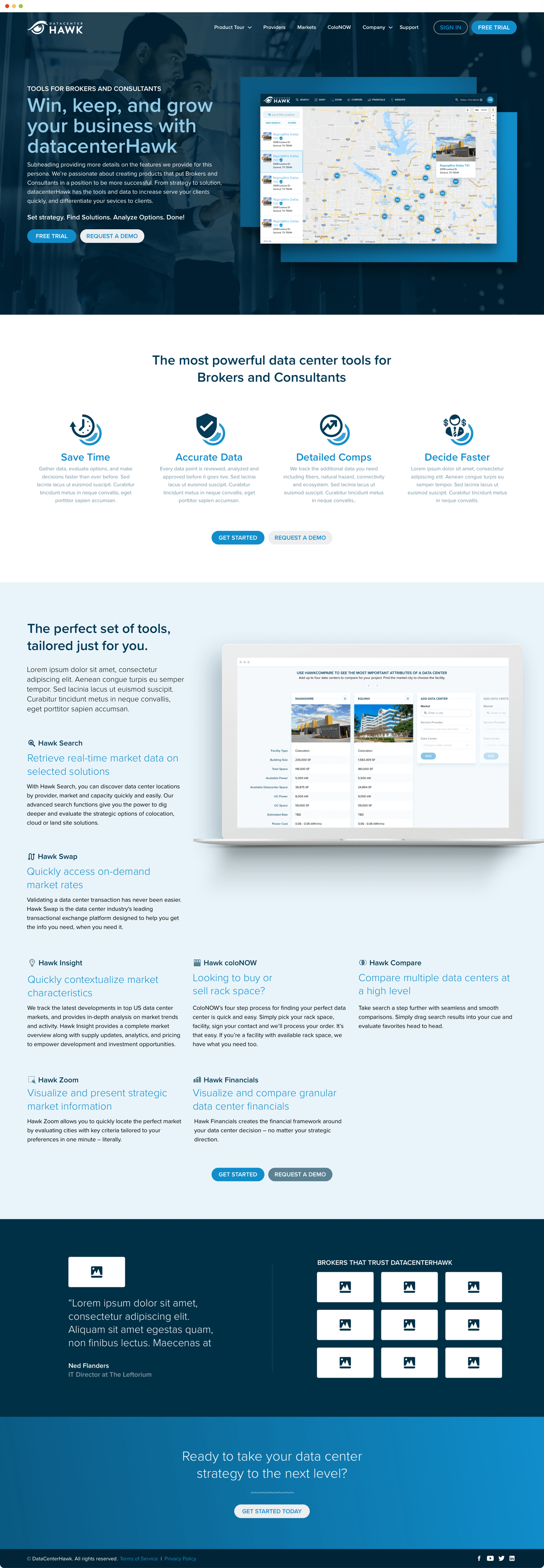
- Persona landing pages targeted to operators, investors, and end users
- A blog and market insight structure to carry their research
- Campaign pages promoting coloNOW to both sides of the marketplace
Decision 05
Take the system past the screen.
Most engagements stop at the screen. But datacenterHawk sells through conversations — conferences, meetings, follow-ups — and a one-sheet that doesn't match the site undoes the work the site just did.
So the same system extended into sales sheets, social media ads, and business cards: the type scale, the color, the data-presentation patterns from the product. The material a rep hands across a table belongs to the same company as the ad that generated the lead and the trial they're asking for.
Product, web, and print designed by one person, in one system, in one engagement.
This is the part most consultants have to subcontract. Being able to carry a brand from a dashboard to a printed leave-behind without a handoff is the difference between consistency as a goal and consistency as a result.
What shipped
One company, on every surface.
- A redesigned product experience across search, comparison, dashboards, provider profiles, and the coloNOW ordering flow — 200+ screens with responsive tablet and mobile layouts
- A branded pattern library and front-end standard drawing on Carbon and Bootstrap
- The coloNOW feature and workflow, letting facilities sell available cabinet space
- A lead-converting marketing site — homepage, mega menu, pricing, blog, persona landing pages, and campaign pages
- Sales sheets, social media ads, and business cards built from the same system
The engagement moved both surfaces. On the public pages, prioritizing the information architecture and clarifying primary and secondary actions increased actionable facility leads by 4%. Inside the app, surfacing more of the platform's toolset raised usage by 42%. The pattern library underneath both held consistency as the product grew, and is the reason the same team could keep extending it.
What's next
Got a product, a site, and a brand that don't match?
That gap is usually costing more than it looks like from any single page. Let's talk about what it would take to close it.