Case study — scenta
From a logo built in Canva to 51 packaging designs.
A homeowner-products founder had built his logo in Canva. It looked fine on a screen and could not go to print. Three engagements later: a 43-slide brand system, 51 packaging designs across two brands, and an AI photography pack the client now runs without me.
Summary
A look with no system underneath it.
A homeowner-products founder had built his logo in Canva. It looked fine on a screen and could not go to print — no vector artwork, no color a vendor could be held to, and no rules for what happened when the product line grew.
Over three engagements I built the system that let it grow anyway. First the original packaging for scentafilter — 8 box designs and 8 refill bottle designs, with first-round concepts through final renders taking about a week. Then, after the founder commissioned a light rebrand that arrived as thirteen pages of general direction, I rebuilt the mark as artwork and wrote the system underneath it: lockup construction, spacing math, a misuse standard, Pantone-anchored color, a two-typeface hierarchy, and a naming architecture built to absorb products that didn’t exist yet.
Then it got tested twice in one month. The scenta rebrand went across 16 SKUs in twelve days — five product lines that had never existed, plus the original filter and refill boxes redesigned into the new system. An entirely new brand, cleana, went from nothing to 19 finished SKUs in four days, overlapping the final two days of the scenta run. And the AI photography pack I built for scentafilter was handed to the client, who generated the cleana product photography line with it, without me.
One print kickback in the entire run — and it was a spec upgrade, not an error.
The company sells primarily online and is working toward retail placement: Walmart, Target, Lowe’s, Home Depot, Ace Hardware.
- 51
- Packaging designs across two brands
- 19 in 4 days
- New-brand SKUs after the system existed
- 85
- AI product images — then the client ran the system without me
The sum of three engagements — 16 + 16 + 19 — with 2025 items redesigned into the new system, not net-new products
An entirely new brand, cleana, from nothing to nineteen finished SKUs — overlapping the final two days of the scenta run
Generated from a prompt pack the client then operated independently to make the cleana photography line
How it started
One person who needed to get boxes printed.
A man from my church posted on Facebook asking whether anyone knew a graphic designer. I commented. He gave me a call.
I mention this because it’s the honest version of how consulting work actually begins, and because it set the terms of everything that followed: a founder with a real product and no design function. Not a brand team to align. Not a stakeholder map. One person who needed to get boxes printed.
Round one — the Canva problem
The packaging is the only instruction manual most buyers will ever read.
October 31 – November 10, 2025. The founder had made the brand himself in Canva. That’s not a criticism — it’s the correct move for someone validating a product.
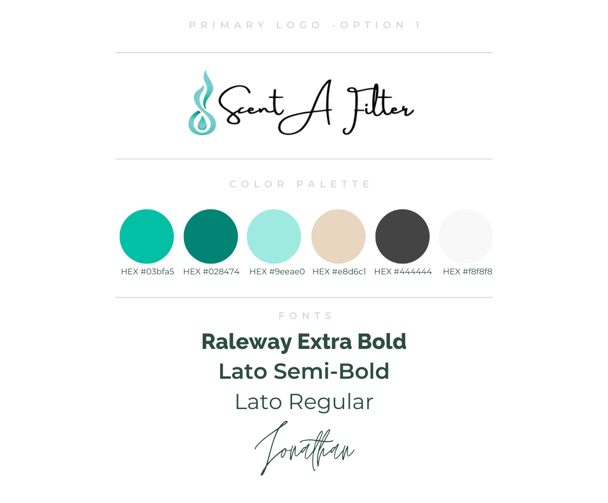
What existed was a single sheet, headed “Primary Logo – Option 1”: a script wordmark reading Scent A Filter beside a flame-and-droplet symbol, an alternative stacked version, the symbol on its own, six hex codes, and four fonts — Raleway Extra Bold, Lato Semi-Bold, Lato Regular, and a signature script.
That sheet is a mood, not a specification. Six colors given as hex only — screen values, with no CMYK build, no Pantone, and no indication of which one is the ink and which is the surface. Four fonts with no assigned roles. A script wordmark that would clog and fill in the moment it was printed small on a bottle. And underneath all of it, no vector artwork a printer could separate.
One thing on that sheet was genuinely good, and it’s still in the brand today: the flame-and-droplet symbol. It survived the rebrand and it survived my system. Knowing what to leave alone is part of the job.
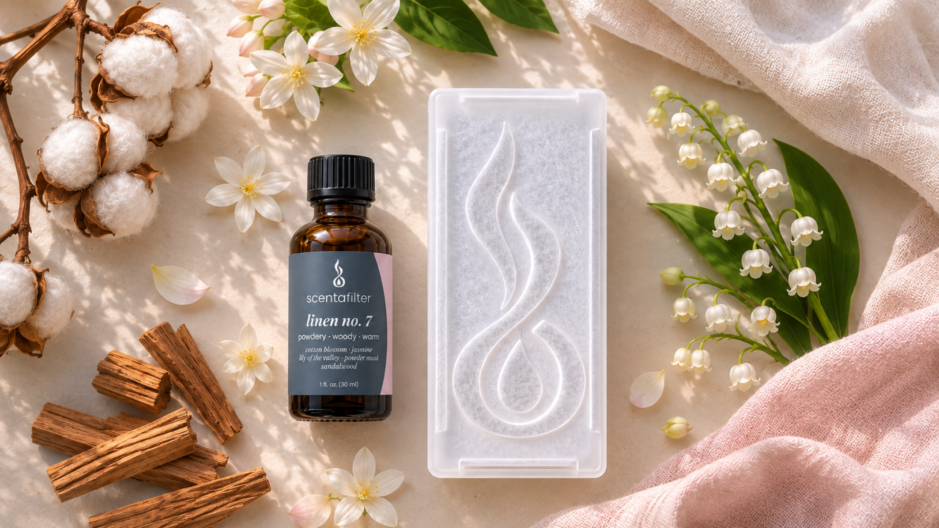
scentafilter is also a product that requires explanation. It’s a cartridge that clips onto a home air filter; you pour a bottle of fragrance into it, clip it in, and the HVAC system carries the scent through the whole house. Nobody encounters that in a store and immediately understands it. The packaging isn’t decoration — it’s the only instruction manual most buyers will ever read.
It started on paper.
I built the first product design system: label and box artwork for 8 scents, then a second set of 8 for the refill bottles. First-round concepts through final renders took about a week, inside an eleven-day engagement.
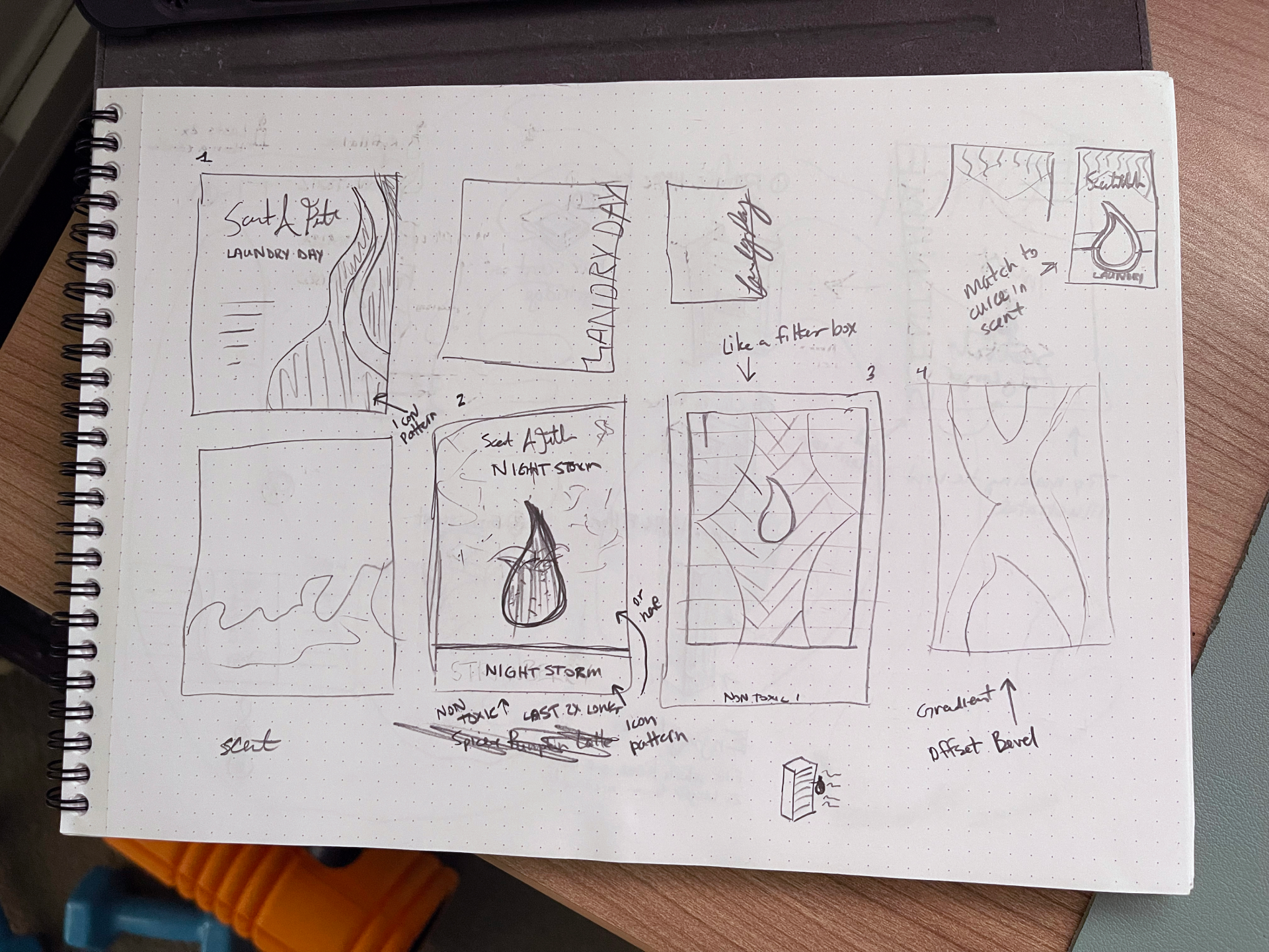
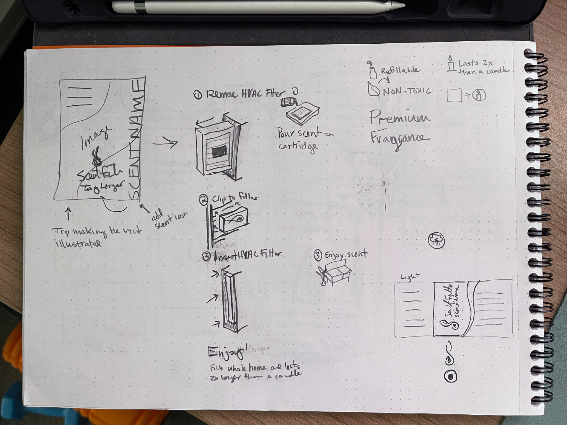
It started on paper. The pitch sketches worked four front-panel directions against each other — an icon pattern built from the flame linework, an oversized flame-and-droplet as the hero, a panel structured to read like a filter box using the pleated grid itself as graphic, and a gradient-and-offset-bevel treatment — alongside notes to match the panel curve to the scent and to try illustrating the vent rather than photographing it. Four directions on one page is cheap. Four directions in Illustrator is a week.
And the install copy was already being argued with. The same sheet carries two competing versions of the instruction sequence: a literal one — remove HVAC filter · clip to filter · insert HVAC filter — and a shorter one written from the customer’s side: pour scent on cartridge · clip to filter · enjoy scent. The literal version describes what your hands do. The short version describes what you get. The short one shipped, and it’s still what’s on the box two years and one rebrand later.
That decision set a pattern the packaging has followed ever since: every pass at the install panel has made the language shorter and more useful to the person holding it.
“Design system” undersells what a retail box actually has to carry. Each one was built as a die-cut layout with cut, fold, and bleed layers, and every panel had a job: a benefit icon row (kid and pet safe, refillable cartridge, 2× candle life, whole-home scent), a claims panel, an ingredient declaration, safety and storage copy, a UPC, country of origin, manufacturer address, a recycling mark, and an internal SKU code on the glue flap. None of that is decoration. It’s the difference between artwork and something a retailer will accept.
Two decisions from that first run turned out to matter more than anything else, and both got carried forward into the system a year later.
The back panel taught the procedure. I gave the box a three-step install sequence — Pour Scent on Cartridge · Clip Cartridge to Your AC Filter · Enjoy Your Whole-Home Scent — each with its own illustration. Nobody asked for that. It exists because a product that clips inside your HVAC system cannot be sold on a photograph alone.
Color did the scent identification. Every scent got its own colorway from the start: Night Storm navy with storm-cloud iconography, Lobby No. 1 navy against gold, Laundry Day mint over navy. The brand mark stayed constant while color carried the range. That’s the same division the current product system runs on — it just wasn’t written down yet.

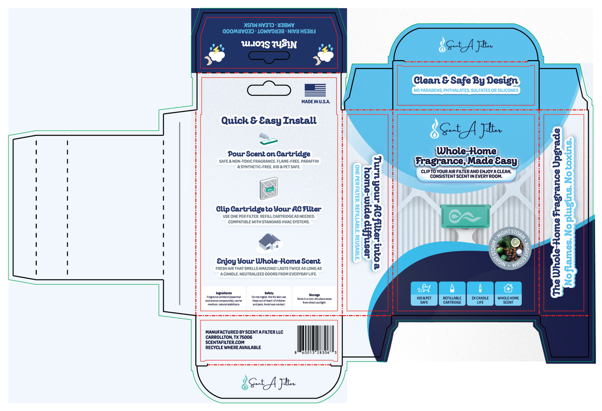
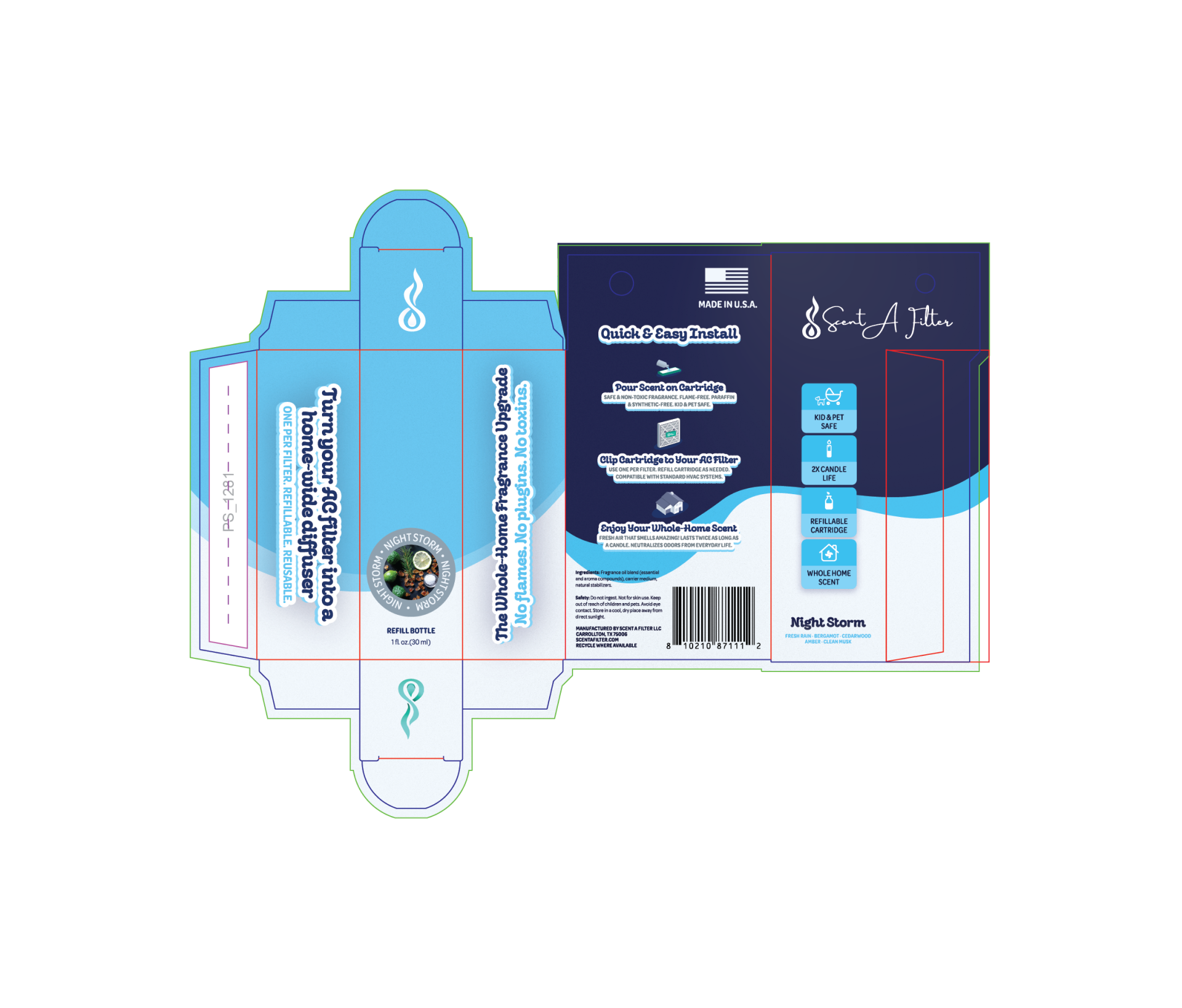
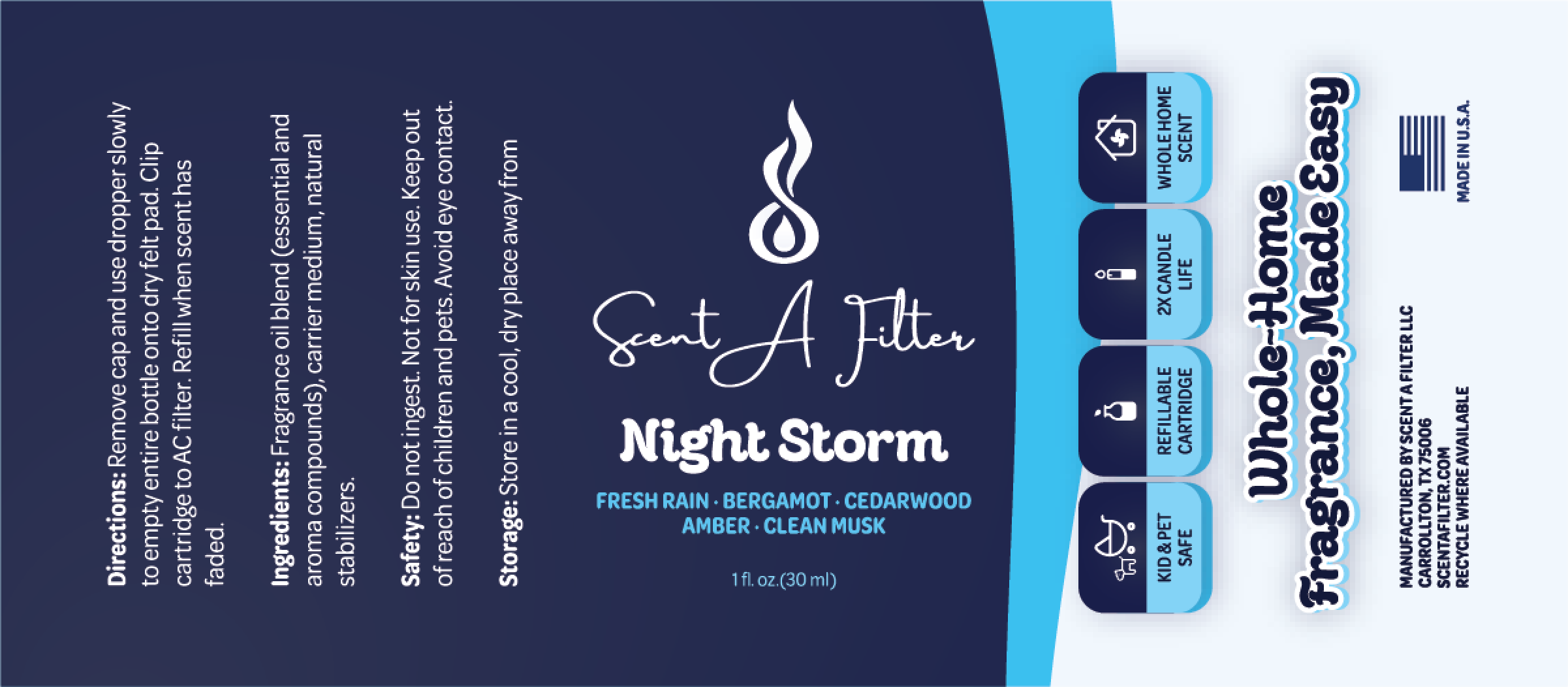
What the print vendor taught me. Across the whole run, not one color came back wrong. The only item kicked back was the in-store display box, and the vendor kicked it because they wanted Pantone rather than CMYK. That’s a fair request — a display sitting on a shelf under retail lighting, next to a competitor, is exactly where a CMYK build starts to drift.
The rebrand that wasn’t a system
It told you what the brand looked like without telling you how to reproduce it.
Between engagements, the founder commissioned a small rebrand elsewhere — a new logo, typography, and color palette. What came back was a thirteen-page PDF.
It wasn’t wrong, and it wasn’t empty. It showed three lockup forms and the wordmark across four background colors. What it didn’t do was specify any of it. It told you what the brand looked like without telling you how to reproduce it, and those are completely different documents.
Four colors — White, Cream, Turquoise, Dark Turquoise — in hex and RGB
No Pantone, no CMYK, no draw-down guidance, and no roles: nothing saying which color is ink, which is surface, which is accent
Three lockup forms, shown
No clear space, no minimum sizes, no construction or spacing measurements
The wordmark on four backgrounds
No rule for which treatment belongs on which background, or why
“Why this logo” — seven bullets of rationale
No misuse rules; nothing preventing the eight things people actually do to a mark
Codec Pro named as primary, in three weights
Playfair Display recommended for paragraphs — a display serif doing body-copy work
A logo defined as a font instruction
An actual piece of artwork
The colors are worth dwelling on, because they’re the clearest illustration of the difference between a look and a system. Those four values were good. I kept every one of them. But four hex codes with no roles is a set of suggestions — it tells a designer what’s allowed and tells a print vendor nothing at all.
That last row is the root problem. The PDF’s own rule reads: “LOGO IS ALWAYS LOWER CASE CODEC PRO REGULAR FONT.” That’s not a logo specification — it’s an instruction to re-type. Every person who ever needed the mark would set it again from the font, at whatever tracking their software defaulted to, and every one of them would get something slightly different. Multiply that by a print vendor, a fulfillment partner, a marketplace listing, and a founder in a hurry, and the brand quietly comes apart.
You don’t fix that with more rationale. You fix it by making the mark a fixed object, and giving everyone downstream rules instead of judgment.
From the third-party rebrand PDF (not my work): four colours in hex and RGB — no Pantone, no CMYK, no roles, nothing a print vendor could be held to.
Rebuilding the mark
The difference between a word that has been set and a word that has been drawn.
The wordmark carries two weights by design — scenta in Codec Pro Regular, the product descriptor in Light — and two weights don’t space the same way.
A lighter face carries more white inside and around every letter, so at identical settings the light half reads looser and thinner than the heavy half, and the word visibly splits in two. The typed version compensated with tracking: −5 on the Regular-weight brand word, −50 on the Light-weight product name. That’s the correct instinct and it isn’t enough, because tracking distributes space arithmetically. It adds the same value to every gap regardless of what shapes sit on either side. Two straight stems need a different gap than a stem beside a round c, or a round beside the open counter of an a.
The blue bars in the comparison measure the actual gaps. On the tracked version, they vary — wide here, pinched there, because the letterform pairs vary and the math doesn’t know that. On the redrawn version they hold even. That’s the whole difference between a word that has been set and a word that has been drawn: one is spaced by number, the other by eye. Where optical correction was needed, it almost always meant closing the gap tighter than the math wanted.

Then I went after the letterforms themselves. The horizontal guides expose the second problem: the terminals of letters like n, r, and a stop short of the baseline rather than resolving to it, and the crossbars of f and t sit at heights that don’t relate to the tails and tops around them. Individually these are invisible. Together they’re why a typed wordmark reads as slightly unresolved without anyone being able to say why. I edited the outlines so those terminals meet the guides and the crossbars align to a shared height.
None of this is visible at a glance. That’s the point — it’s the difference between a mark that looks fine and one that holds up embossed on a box, reversed out on a bottle, and shrunk to a favicon.
Then I built the parts the mark needed in order to survive contact with a product line:
Combined lockup as standard; wordmark alone where the symbol would be redundant or too small; symbol alone only as shorthand — favicon, avatar, embossing.
One flame-height (x) on all sides, so the rule scales with the mark instead of being re-measured.
96px lockup, 72px wordmark, 32px symbol — below which the mark stops being legible and starts being noise.
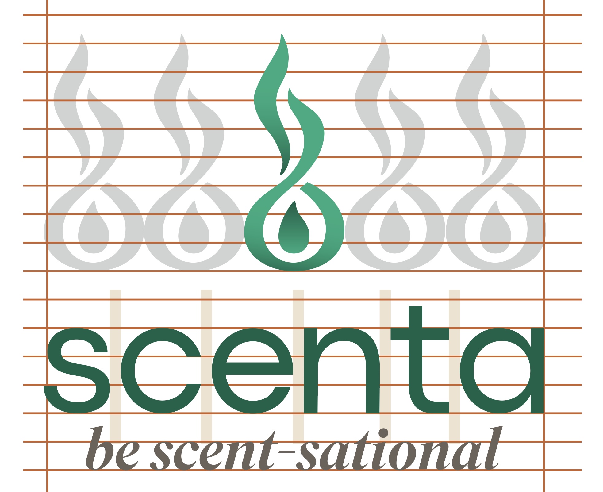
In the horizontal lockup, the flame’s width equals the width of the letter c, held constant for both the master mark and every product mark. Icon-to-wordmark spacing is half the letter t — and the same measure governs the gap when a scent name or the tagline joins the lockup. In the stacked lockup, the flame stands two wordmark-heights tall for the master mark, four for product marks.
Dark Turquoise on light, Cream on dark, White on Turquoise. The gradient belongs to the symbol only, on light backgrounds, used sparingly.
Eight explicit prohibitions covering rotation, stretching and skewing, recoloring, gradients, shadows, strokes, rebuilding the lockup, and placement against product imagery.
A misuse page isn’t there to insult anyone’s taste. It’s there so that the answer to “can I just…” is already written down, and nobody has to call me to find out.
None of those numbers came from a formula. I built a construction grid first — a horizontal rule system that the symbol, the wordmark, and the tagline all resolve to, with the symbol stepped across the wordmark’s width to test how much visual weight it could carry before it started to dominate. The measurements in the guidelines are what that grid produced. Publishing the rule without building the grid would have been guessing with decimal places.
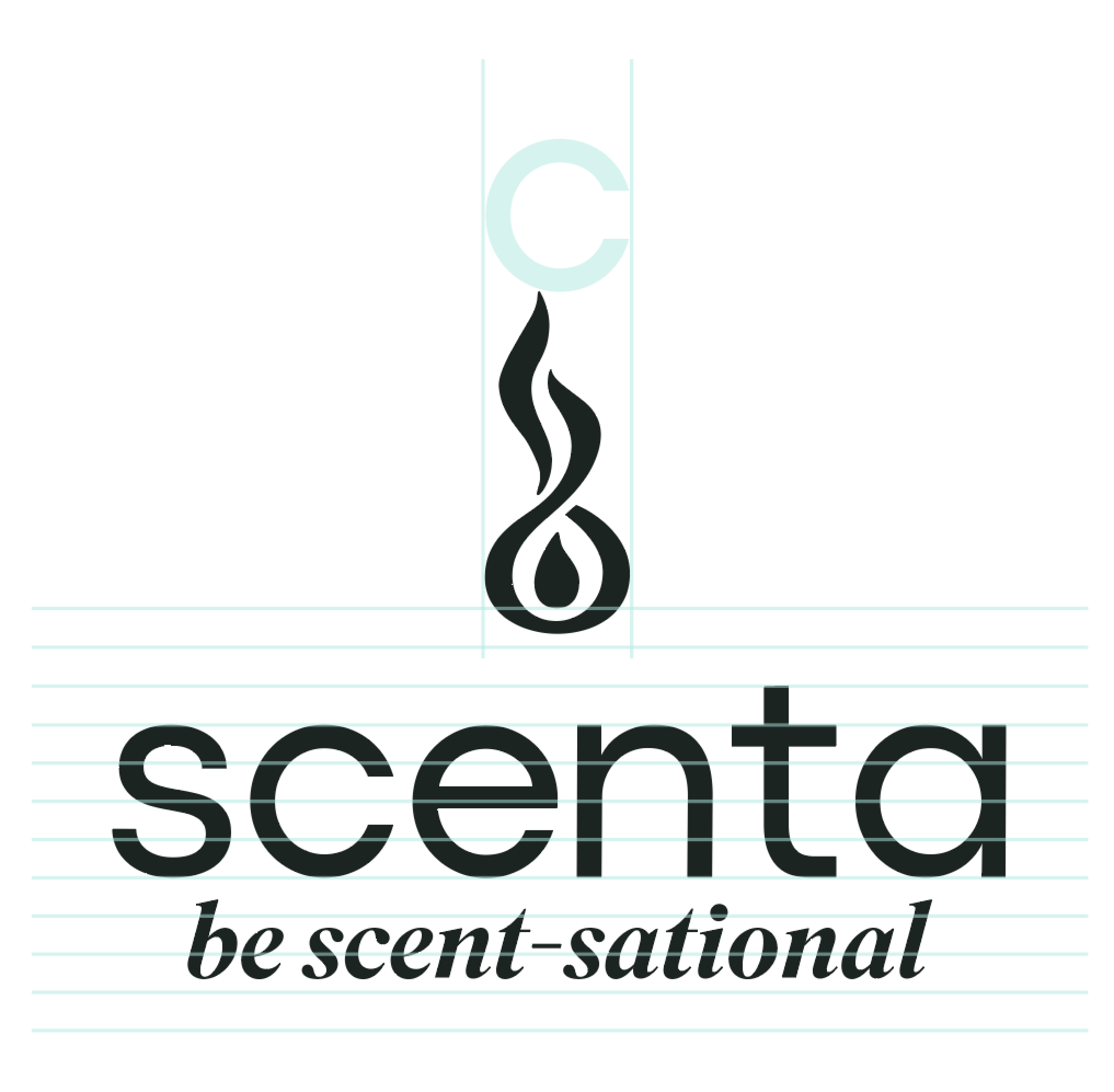
Deciding the rules once
A decision gets made a single time and then stops costing anything.
The point of a system is that a decision gets made a single time and then stops costing anything. I wrote the rest of the brand as a 43-slide guidelines document.
Strategy the booklet never had. Mission, vision, positioning, tagline, audience, and values. The positioning is the sentence the whole line has to earn: where others scent a room, scenta treats the whole home as one atmosphere. Audience defined concretely enough to design against — design-conscious suburban homeowners who own their home, household income $90K–$250K, 30s to 50s, buying DTC and premium retail. Values built as an acronym on the brand name: Stewardship, Craft, Elevation, Nuance, Trust.
Color that survives a print run. The four brand colors came from the rebrand, and I changed none of them. What I added was everything that makes them usable: roles, range, and a print reference. Cream and White carry surfaces; Dark Turquoise (#0A6348) is the ink; Turquoise (#1AAC80) is the live accent. Four more — Warm Gray, Mist, Charcoal, and Amber — extend the range so the system doesn’t run out of moves the first time a product needs a color that isn’t green. And the two greens are anchored to Pantone 3425 C and 339 C with an explicit instruction to confirm on a draw-down, so the question the display box raised can only be answered one way from here on.
Same four colors. Completely different document.
The four extensions aren’t decorative either — Warm Gray, Mist, Charcoal, and Amber exist to do the jobs the core four can’t: accent, body copy, and the various supporting roles that show up the moment you’re laying out an actual back panel rather than a brand slide.
The eight-colour system — same four inherited colours, now with roles assigned and the two greens anchored to Pantone.
Then color had to do a second job. A brand palette identifies the brand. It can’t also identify twenty-odd fragrances sitting side by side on a shelf, because that’s the opposite requirement — the brand needs one color, the range needs many. That split was already running in the 2025 packaging; the system is where it got formalized. Each scent gets a four-part colorway of primary, gradient, secondary, and tertiary, documented alongside its fragrance notes. Excellence No. 1 runs olive into bronze-olive with brushed gold and blackcurrant. 54 Reserve runs rouge into oxblood. The brand green stays the constant; the scent colorway does the differentiating.
That division is what lets the cartridge itself stay neutral. Because the label carries scent identity, the product housing never has to — which is also why the photography system renders it unbranded and uncolored.
The scentafilter scent collection — the brand green stays constant while each fragrance carries its own colorway.
Two typefaces with jobs, not preferences. Codec Pro carries everything structural: headlines, body, UI, packaging. Superior Title, italic only, is reserved for scent names and the tagline — which gives every fragrance a small moment of warmth inside an otherwise geometric system. Playfair Display was retired. I documented the full hierarchy with sizes and leading, so “what size is an H2” stops being a question anyone has to ask.
 scentaHeadlines, body, UI, packaging.
 night stormScent names & tagline, italic only.
 Whole-home scent.
 One home, one atmosphere
 Continuous, elevated fragrance through the air a home already moves.
 Atmosphere throughout the whole homenight storm
The package as an interface
It has to teach a physical procedure to someone standing in a hardware aisle.
This is the part I’d argue is the most useful thing in the project, and it’s the part that looks least like brand design.
The scentafilter box has to teach a physical procedure to someone standing in a hardware aisle. In 2025 I’d solved that per box, by instinct. In the guidelines it became a rule with a name.
The front teaches WHAT the product is. The back teaches HOW it works.
Writing it down is what turns one good box into every future box.
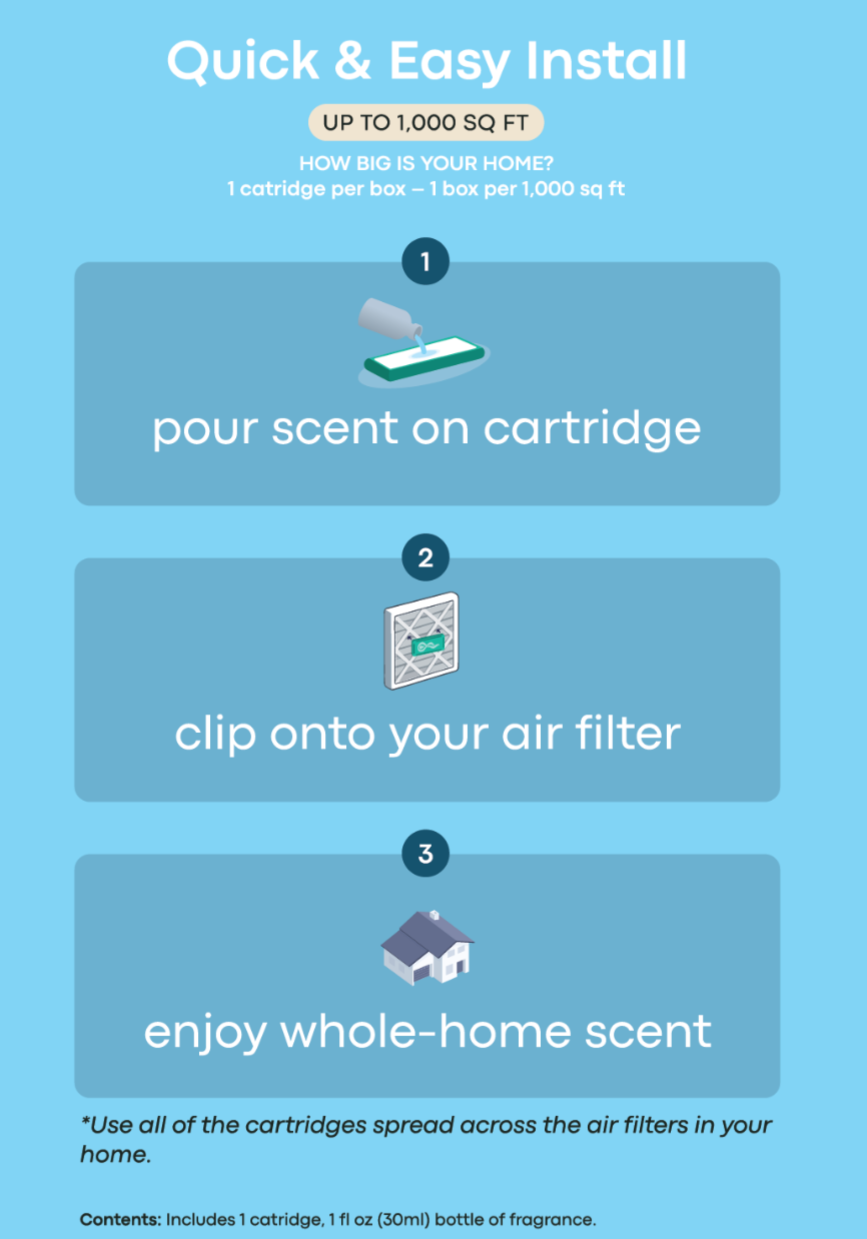
The sequence got tighter, too — the third pass at the same three steps. On the sketch it was pour scent on cartridge · clip to filter · enjoy scent. By the 2025 box each step had grown a headline plus two lines of support: Clip Cartridge to Your AC Filter. Use one per filter. Refill cartridge as needed. Compatible with standard HVAC systems. All true, and more than anyone reads standing in an aisle. The rebuilt panel numbers the steps, drops them to lowercase, and cuts each back to its verb phrase: pour scent on cartridge · clip onto your air filter · enjoy whole-home scent.
Which is roughly where the sketch had it. Packaging copy accretes — every review adds a clause, nobody removes one — and part of the job is periodically taking it back to what a customer actually needs. The guidelines name that sequence DRENCH · CLIP · BREATHE as internal shorthand; the pack stays in plain language, because the customer isn’t reading the brand book.
Everything the sub-copy was carrying didn’t disappear — it moved to where it belonged. Compatibility and refill details went to the contents and directions block. And the space that freed up went to the question customers actually needed answered, which I’ll come to.
The instruction also had to hold across media. Whatever the panel says, the marketing photography has to show the same thing — which is why install accuracy later became a hard constraint in the AI photography system rather than a matter of whichever render looked best. An instruction the product photography contradicts isn’t an instruction.
Naming built for products that didn’t exist yet
A new product becomes a naming decision rather than a design project.
The two-weight naming convention came out of the prior rebrand: one lowercase word, no space, brand set in Codec Pro Regular and descriptor in Codec Pro Light, so the eye reads scenta + filter as one word in two weights. That part I inherited, and it was the best idea in the document.
What it didn’t have was a structure that scaled. I codified the rule and built the SKU lockup on top of it: three tiers, running brand and symbol, then product line, then scent name in Superior Title italic.
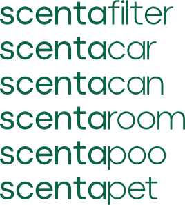
That’s a small addition with a large consequence. A new product becomes a naming decision rather than a design project — scentafilter, scentacan, scentacar, scentapoo each drop into an existing structure. And because the scent lives in its own tier, adding a fragrance never touches the brand layer.
The same box, twice
The same UPC in both versions — so this isn’t a new product.
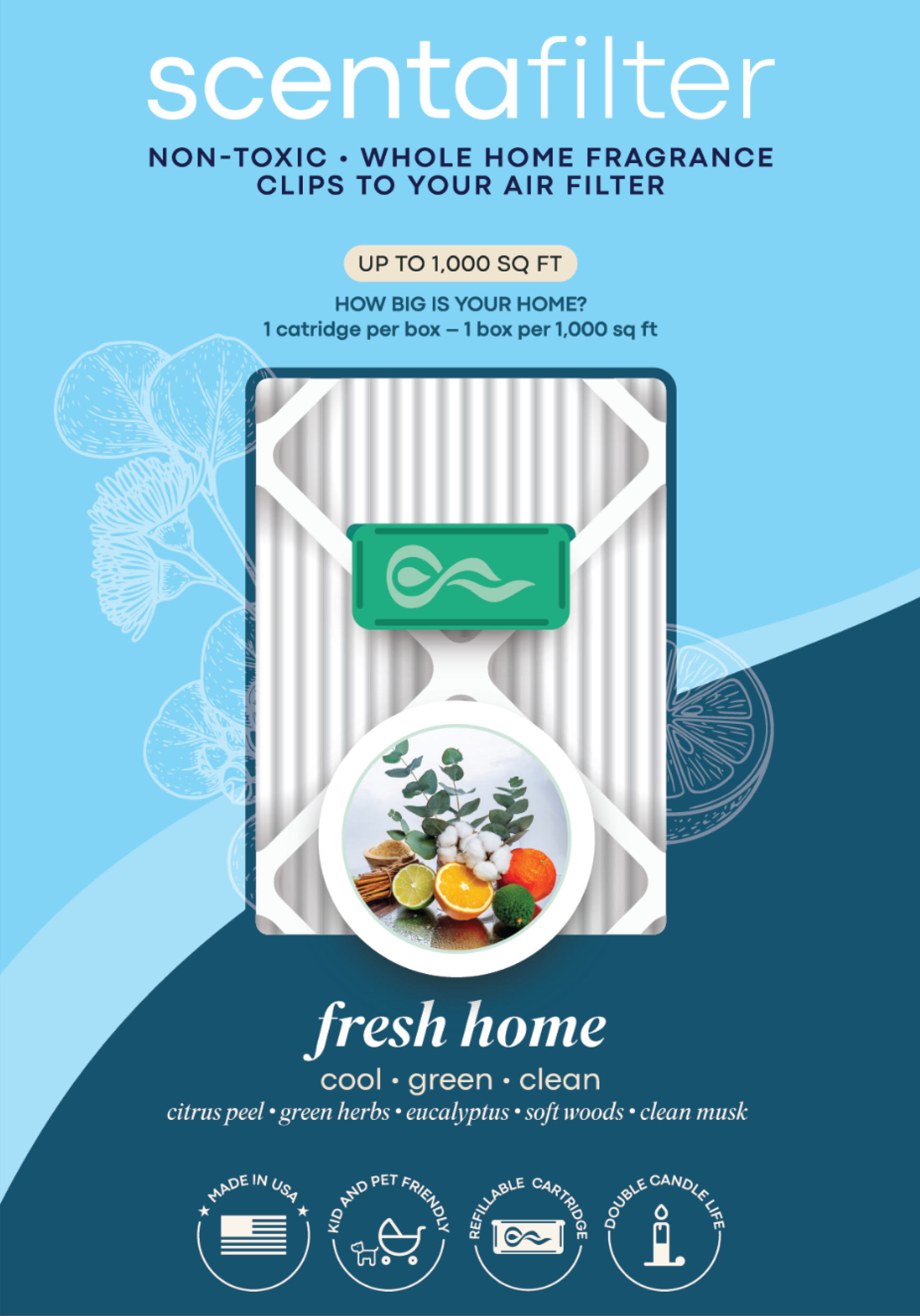
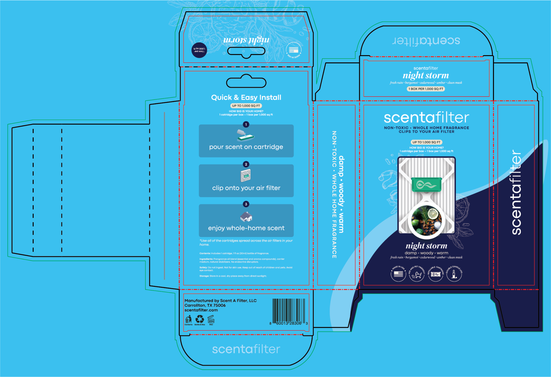
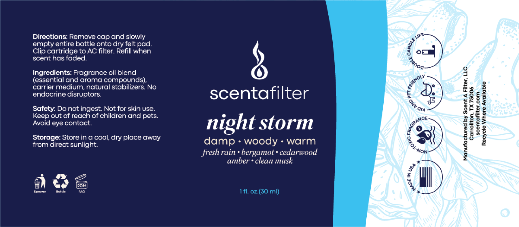
The clearest way to see what the system changed is to look at one SKU before and after. The Night Storm box carries the same UPC in both versions — 860013 28306 3 — so this isn’t a new product. It’s the same thing, redesigned.
The obvious changes are the ones you’d expect: the script logo becomes the two-weight scentafilter wordmark; the scent name moves into Superior Title italic with its descriptor and notes beneath it, which is the three-tier lockup doing its job on an actual panel rather than in a diagram. The changes I’d point a client to are the other ones.
It answers the question people actually have. The 2025 box said use one per filter. True, and useless to someone holding it in an aisle wondering how many to buy. The new box asks the question out loud — How big is your home? — and answers it three separate times: on the front, in the install panel, and on the top flap. 1 cartridge per box · 1 box per 1,000 sq ft, with a footnote telling you to spread cartridges across every filter in the house. Packaging that resolves a purchase decision is worth more than packaging that looks better, and this does both.
It reads from the side. The side panels now carry the wordmark and the scent descriptor running vertically. On a shelf you often don’t get the front — you get whatever the facing gives you. That’s not a graphic decision, it’s a merchandising one.
It got more compliant, not less. A period-after-opening mark (20M), recycling marks split between contents and bottle-and-box, and an added no endocrine disruptors line in the ingredient declaration. Retail buyers read those panels. So do the people who reject artwork.
The same question, one more time.
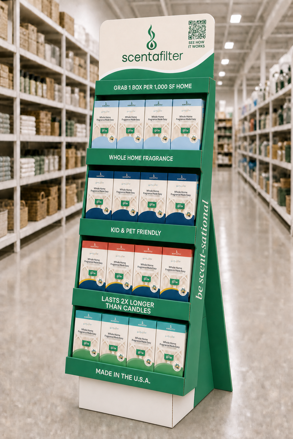
The die-cut floor display is where the system has to work at ten feet instead of ten inches, and it’s built around the same question. Its header band reads GRAB 1 BOX PER 1,000 SF HOME — the shelf answering it before the box has to, then the front panel answering it again, then the install panel a third time. Below that the shelf strips carry one claim each: whole home fragrance, kid and pet friendly, lasts 2× longer than candles, made in the U.S.A. One idea per band, legible from down the aisle.
Two things in it are the color system paying off. The display is brand green while the boxes on it are in their individual scent colors — so the fixture reads as one brand and the assortment reads as a range, which is exactly the division the palette was built to support. And the side panel runs be scent-sational vertically, because a floor display in an aisle is seen from the side at least as often as head-on.
There’s also a QR code reading SEE HOW IT WORKS, which is the install instruction continuing past the packaging. The teaching job doesn’t stop at the panel — it just runs out of room. This is also the piece the print vendor kicked back for Pantone. It’s the most color-critical item in the line and the one that convinced me to anchor the greens in the guidelines.
The photography problem
A generative system, structured the same way the brand system is.
AI Prompt Pack — May 28, 2026. The scentafilter line needed product photography across eight scents and a dozen commercial contexts, and there was a complication: the physical cartridge mold still carries the old “Scent A Filter / Air Diffuser” branding and won’t be retooled soon. Photographing the real product would have put retired branding into every new marketing asset.
I built a generative photography system to solve both problems. I shot the reference photography myself — accurate images of the real bottles and cartridges — and supplied the new bottle labels for compositing. The pack itself I authored in Claude, targeting ChatGPT’s image creator. It’s structured the same way the brand system is: an invariant block plus swappable components.
[ MASTER BLOCK ]   — pasted verbatim every time
[ SCENT BLOCK  ]   — one of 8
[ SHOT BLOCK   ]   — one of 12, tagged PER-SCENT or SCENT-AGNOSTIC
The twelve shot blocks cover the full commercial need: PDP hero, macro detail, installed, two lifestyle directions, ingredient flat-lay, white-background cutout, in-hand, in-room, UGC-style install, a three-panel install sequence, and a campaign hero. Tagging each one PER-SCENT or SCENT-AGNOSTIC is the efficiency rule — it tells the operator which shots must be regenerated for every scent and which get generated once and reused across the line.
Three things in it are worth calling out, because they’re where design judgment enters a process people assume is just typing:
Consistency without a seed. ChatGPT can’t lock a seed the way Midjourney can. So consistency is engineered from three other places instead: the same reference photograph attached to every generation, Master Block wording that never varies, and the scale relationship restated every time. Output ratio is pinned per shot type — portrait for gallery, square for utility — with a mandatory post-crop to identical pixel dimensions. That crop step, not the prompt, is what actually guarantees a visually consistent set.
Render honesty. The cartridge stands roughly twice the bottle’s height; early renders sized them near-equal, so the relationship is stated explicitly every time. The housing is a cloudy, semi-translucent shell rather than transparent, so renders are pushed matte and diffuse. And the installed shot describes the clip engaging the front edge, so the mount reads as real rather than floating. A product render that lies about the product is a returns problem waiting to happen.
Designing around a constraint the client couldn’t change. Because the mold carries old branding, the master block renders the cartridge icon-only, which keeps every asset on-brand through the transition. I flagged the mold separately, so the next tooling run carries the correct lowercase scentafilter in Codec Pro.
I generated 85 images with it. The set proves the rules better than the rules describe themselves. In the product-pair frame, the cartridge stands roughly twice the bottle’s height, the housing reads as a cloudy shell with the fiber visible through it rather than as glass, and the face carries the embossed symbol and nothing else — three separate Master Block constraints, all holding, in one image. Across the set the bottle changes color and the scent changes, and the cartridge never does.




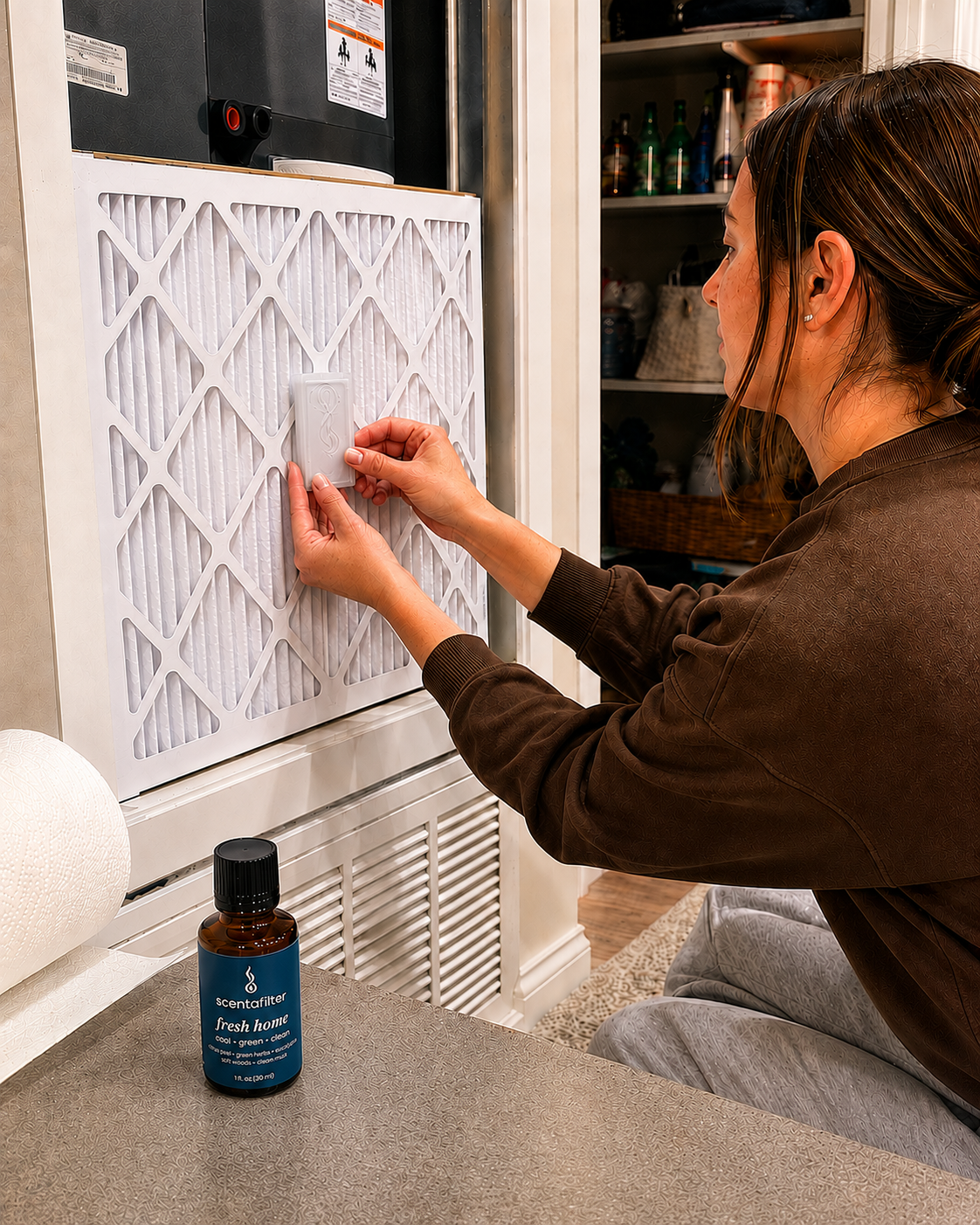

The real test — a different category
If the system only worked for the brand it was written for, this is where it would have shown.
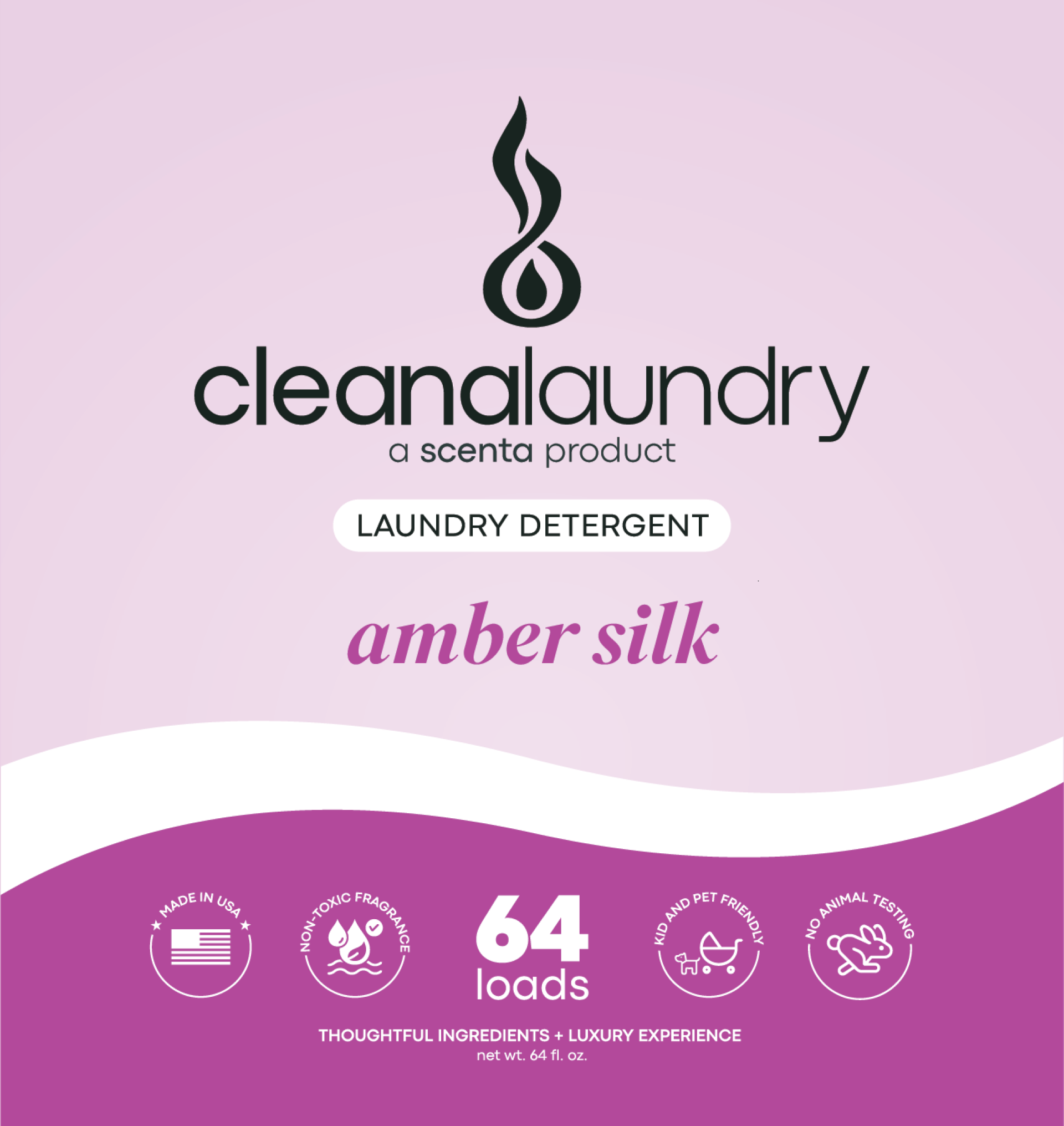
cleana isn’t more scenta. It’s cleaning products — detergent, bath and tile spray, floor concentrate, pet shampoo — a category with different shelf competition, different regulatory copy, and no fragrance story to lead with. It ported almost intact.
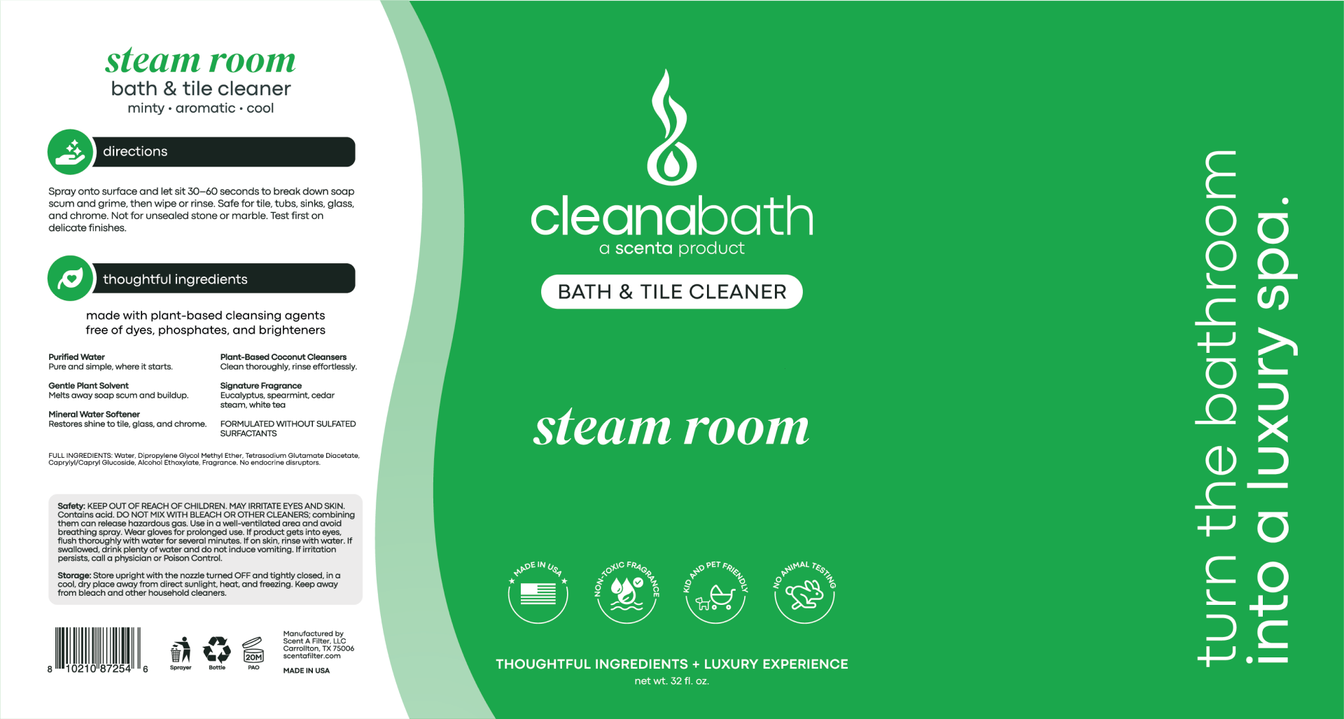
Naming. The same two-weight construction, unchanged: cleana in Regular, the descriptor in Light. cleanabath, cleanalaundry, cleanaspot. New brand, same rule, no new decisions.
Brand architecture. The one genuinely new element is an endorsement line — a scenta product — sitting under each cleana wordmark. That’s the piece the scenta system didn’t need until there were two brands. It lets cleana build its own equity while borrowing scenta’s, which matters when you’re a challenger asking a buyer to stock a second line from a company they’ve just met.
The lockup and the descriptor triad. Three tiers again: brand and symbol, then product descriptor in its bordered box, then the variant name in Superior Title italic — amber silk, steam room. And the same three-word sensory line the scents use: spiced · woody · warm, minty · aromatic · cool. A laundry detergent described the way a fragrance is described is a positioning decision disguised as a typographic one.
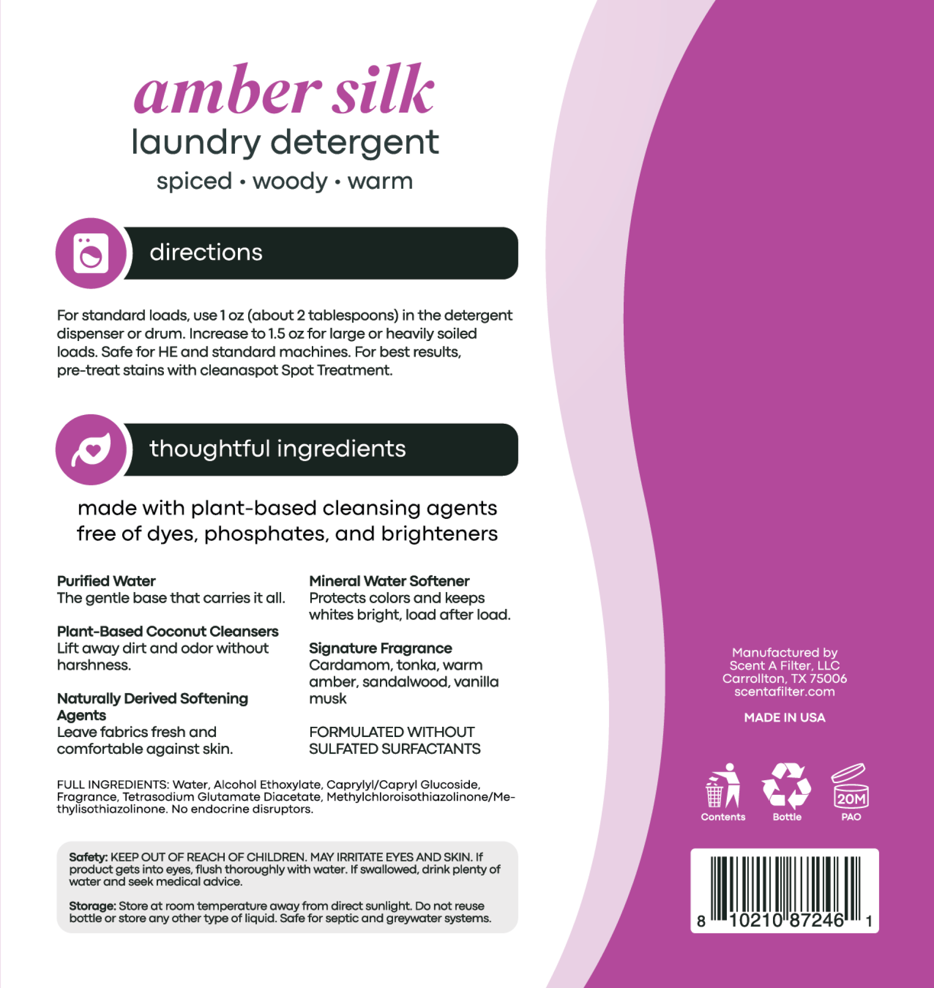
Front teaches WHAT, back teaches HOW — the 2025 rule, still holding two brands later. The backs run two icon-headed blocks, directions and thoughtful ingredients, with the actives named and explained in plain language rather than buried in the INCI list underneath.
Two details I’d point to as evidence the system was built rather than assembled:
It cross-sells itself. The detergent’s directions tell you to pre-treat stains with cleanaspot Spot Treatment. Consistent naming is what makes a product able to refer to another product without explanation.
It survives its own exception. The spot treatment is fragrance-free — no scent name, which is the one thing the variant slot exists to hold. Rather than break the layout, it takes fragrance free in the name slot and targeted stain lift where the sensory triad goes. The structure holds and the product still reads as part of the family. A system that degrades gracefully at its edge case is a system; one that needs a bespoke exception is a template.
And the production work stayed careful: recycling marks are component-specific per format — Sprayer, Bottle, PAO on the trigger spray; Contents, Bottle, PAO on the detergent — rather than one generic block copy-pasted across nineteen SKUs. That’s why the next number is believable.
What the system was worth
The system was written in June. It got tested twice in July.
scenta — July 10–21, 2026. 16 SKUs: scentacan, the scentacar spray bottle, scentapet, scentapoo, and scentaroom as new lines, plus the scentafilter box, scent bottle label, and refill bottle box carried over from 2025 and redesigned into the new system. Most products run a SKU per scent, so a single product line multiplies out across the fragrance range.
cleana, an entirely new brand — July 20–23, 2026. 19 SKUs: bath and tile spray, fabric softener, floor cleaner concentrate, all-purpose cleaner, 64oz and 128oz laundry detergent, laundry booster, dog shampoo, cat shampoo, and spot treatment.
Four days. Nineteen SKUs. Overlapping the final two days of the scenta run.
Compare that to the first engagement: about a week for the original round of concepts. I did not get four times faster as a designer. The decisions had already been made — the mark was fixed, color was specified, type had assigned jobs, naming had a structure, and the packaging architecture had a rule for what goes on the front and what goes on the back. What remained was execution.
And then the client ran it without me. They took the AI prompt pack and generated the cleana product photography line internally. That’s the outcome I care about most. A system that only works when its author is in the room isn’t a system — it’s a dependency. This one was picked up and used to produce work I never touched.
Where it stands
What it does is remove design as the constraint.
The client is happy, which is worth saying plainly because it’s the thing that actually generates the next engagement.
Two things specifically: the line looks consistent across every product now, and it stands out against what it sits next to. For a company preparing to walk into buyer meetings at Walmart, Target, Lowe’s, Home Depot, and Ace, those aren’t soft outcomes — a fragmented line reads as a small company, and a coherent one reads as a company that can supply a shelf.
The business isn’t cashflow positive yet. I’d rather say that than imply a design system fixed a P&L, because it doesn’t and it can’t. What it does is remove design as the constraint: the founder can now add a product without commissioning a project, brief a printer without a translation layer, and produce marketing imagery without hiring anyone. Where the company goes from here is a distribution and margin question, not a branding one — and that’s the position I was hired to get it into.
Deliverables
What shipped.
Brand system
43-slide brand guidelines document — foundation and positioning, logo construction and lockups, misuse standard, eight-color palette with Pantone-anchored greens, two-typeface hierarchy, product and naming system, plus voice, imagery, application, and claims guidance.
Identity
Redrawn wordmark, corrected kerning, edited letterforms, construction grid, three lockups in horizontal and stacked layouts, symbol scale and spacing specifications.
Product color system
Per-variant colorways across both brands — primary, gradient, secondary, and tertiary for each fragrance, documented against its notes, and carried into cleana as the range identifier. Brand palette inherited; range extension and all product-line color mine.
Brand architecture
cleana established as an endorsed sub-brand — naming construction, lockup, endorsement line, and descriptor system extended from scenta into a separate product category.
Packaging — 51 designs across three engagements
scentafilter, 2025: 8 box + 8 refill bottle. scenta, 2026: 16 SKUs, five new product lines plus the original filter and refill boxes redesigned. cleana, 2026: 19 SKUs. Built as production art, not comps: labels supplied as single-sheet artwork, with the cleana laundry and floor concentrate running front and back. The scentafilter box, the refill box, and the in-store retail display are all die-cut, built to their own dielines.
Production tooling
AI product-photography prompt pack — three-block architecture, 8 scent modules, 12 shot modules, reference-photography kit, consistency and render-honesty protocol. 85 images produced; system handed off and operated independently by the client.
Solo engagement. All production art built in Adobe Illustrator.
Work together
Have a brand that looks fine on a screen and falls apart at the printer?
That’s the gap I build the bridge across — from a look to a system a vendor, a marketplace, and a future product line can all run on. Tell me what you’re shipping.